Saturday, October 4, 2014

Art Institute of Chicago Part XV: European Paintings VIII

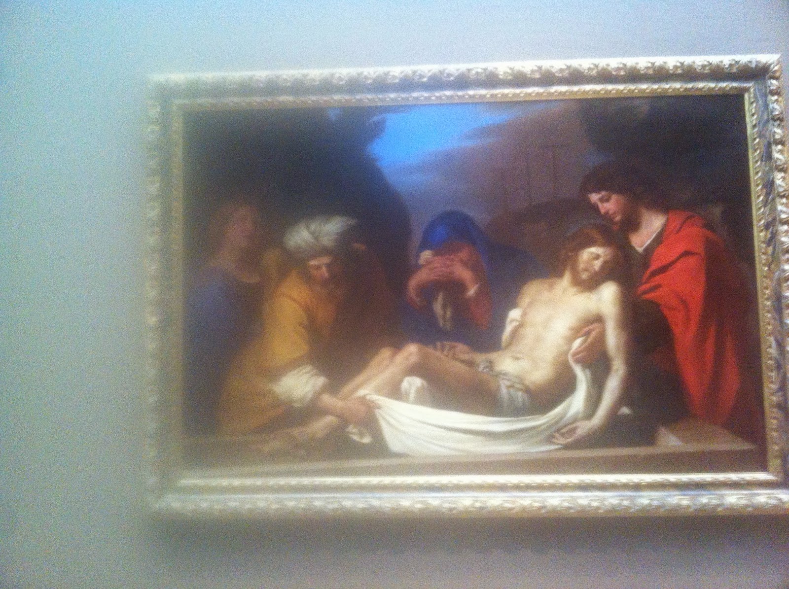
At this point, looking back at my camera roll, I realized even at this point, I was really only mostly through roughly three quarters of the entire content material that I snapped of the entire museum. Indeed, I missed an entire exhibit and a floor and the sheer number of photos that I took was still absolutely astounding. In fact, I must stress that all of these photos also only represent a good chunk of the artworks displayed in the Art Institute of Chicago; there is a lot more variety in terms of artwork displayed in each gallery or exhibit. I only curated some of the more interesting pieces to analysis and blog about.
 
After looking at the previous rather diverse gallery, this next exhibit was measurably more subdued and conformed to archetypical conceptualization. In other words, this painting doesn't evoke the sense of perplexity that the previous gallery did when I first glanced at them. Though, admittedly this painting here does a great job of fooling you until you realize what's so unique about it. On normal inspection, it is easy to mistaken this painting as a dashing young man riding a horse. But look closer and you notice three very distinctive features of this painting. For one thing, The rider is not a grown man - it's a young prepubescent boy riding on the "horse". Which also raise the point that the horse isn't really a horse per se, but a severely undersized donkey or mule. Or, it could be like the ancient equestrian statues - not represent the proportions accurately at all. And finally, the background aren't nearly as emphasized as some of the landscape paintings previously are - the landscape is rather blurred out and shows only subtle details to give a sense of what the environment looks like. I'm glad to have taken a picture of this particular painting - it tricked my eyes into believing the device had a standard composition and subject matter.
As far as paintings of Roman times go, this one is amongst the most elaborate ones that I've seen and also the most confounding one that I've seen. When I first inspected this painting, I'd immediately assumed it was a painting depicting Roman ruins, largely because Roman buildings aren't exactly know for creating vast systems of colonnades and arches without a roof to cover it. The most famous approximation of this trend is Saint Peter's Basilica, with it's clamping series of colonnades and statues in the actual Square. However, that is Christian and post-Roman architecture. That wasn't the only clue that lent clue to what this painting depicted. The presence of Romanesque subjects also gave increasing evidence to my observation. So, this amazing painting of a Romanesque ruin area certainly demonstrated a very divergent depiction of Ancient Rome - with such open expanses bounded by series of arches. These aren't aqueducts either, because of the shape and lack of slopes to direct water. For that reason alone, this painting again proves to one of a series of truly surprising artworks in the Art Institute of Chicago.
Continuing the theme of works of art that defy expectations, this demonstrates a profound departure from normal artistic portrayals. While I am not clear what is going on here, the deformed shape of the  woman is certainly counter to the European general affinity for good aesthetics and pleasant form. Again, the beige composition is rather unique in the large scheme of European art - much like the black and white painting earlier. Unlike the previous Romanesque artwork, this portrait depicts a strong focus towards the central subject. Not only is the woman facially deformed, she is also entirely out of proportion in this painting to illustrate perhaps the intensity of her bodily expression. I left this artwork with a weird feeling because it invades my understand of European art - such elongated figures did not become popular or well known until works like Francesco Goya's Saturn Devouring His Son in 1819
As unsettling this particular artwork was, I didn't remember it was nearly this...unique. I"m not sure if this is a camera issue, but apparently this artwork in similar art style appears to be hanging off the edge of a wall and is transparent to allow the wall to show through. It may have been a photograph of a mirror, but I doubt I would take a photograph like that. Indeed, I'm more intrigued by the mystery and oddity of this particular work of art that I'm more perplexed as to how I even took this photo or how it was possible for somebody in early Europe to perform this kind of effect. However, speaking of the actual subject matter, I must argue that this painting is less dark and mysterious than the previous one, clearly showing a man and woman is some state of disagreement. Of course, the facial features are not very distinct and they demonstrate a poorly formed outline of the faces. Those faces are distorted and the proportions are still completely unrealistic. For example, the man's back should not bend at that angle and from that point on the body - it is completely antithetical to normal degrees of human retrograde movement. Other than the relatively mundane subject matter, I'm still perplexed by how I took this photography, as I can't image a curator hanging an artwork like that on the edge.

The theme of this gallery was "I stumbled in what appears to be a normal looking exhibit only to discover it actually doesn't conform to expectations." Considering the dull affairs of the earlier European paintings in this museum, these paintings are certainly a delightful continuation of artistic wonders that gives people pause to ponder the merits of such art styles.

Thursday, September 18, 2014

Art Institute of Chicago Part XIV: European Paintings VII

Pacing through more exhibits, I was glad that there were some variety in this next gallery. As I walked into the light beige room, I was aware of the following nearly all black and white painting, which absolutely struck me. Indeed, through many years of observing art, it never occurred to me that it was possible for paintings to be black and white. Though technically, the following painting isn't actually black and white, with some hints of red at the sculptures on the left side of the painting - the large majority of it remains black and white. To see this remarkable style certainly was a breath of fresh air after gazing at the numerous colored oil paintings.
Getting into the specifics, I realize how strange it is to see a black and white painting - especially if it was framed like this. Supposedly it was possible to draw on a canvas this large, and then frame it, it would certainly be odd because of the artistic convention to not frame drawings. Therefore, since black and white is frequently associated with drawings, seeing the golden frame around this painting assures me that indeed I was looking at a painting and not a drawing. If anything, paintings enable artists to really create superior lighting - such insane amounts of shading is entirely unpractical using the thin tip of a pencil. I believe that this painting represent a man losing consciousness as he come to contact with an angel, represented by the cherubic babies with the rays of god shining down on the man. Unlike some divine witness artworks, the man is accompanied by a witnesses, who are represented as proportionally shorter men with different skin colors. This distinct difference in scale is odd because such hierarchic scale hasn't been widely practiced since the days of Ancient Egypt and Mesopotamia. Like half of European paintings, this one does not have a discrete background - instead showing a dark background that can only meant to represent the darkened interior of an abandoned building. Or, as I theorize that pre-industrial buildings often lack in interior light because of a lack of light-bulbs and insufficient clerestories.
Imagine my surprise to see a marble sculpture in frontal deep relief right after viewing the "black and white" painting from above. Given the European context, I drew instant parallels to Greco-Roman aesthetics not only because of the material and color, but also the proportions and facial features certainly indicate an obsession with the human form similar to Hellenistic tastes. However, it is unlike Greco-Roman to create such a deep relief with a protruding z axis plane - such artwork was ornamental and required disproportionate amount of marble to create the scene - especially if it was life-sized. However, by far the most striking aspect of this entire marble relief is the instant shot of deja vu - this marble relief is depicting the same exact scene as the painting above. Without looking at the label (it's too small to read), I conjecture that this marble is modeled after the painting in this chicken and egg scenario because black and white paintings are rare and disagree with painting conventions during this period - black and white paintings cannot be spontaneous. By basing the subject matter over the marble sculpture, it acquires a sense of legitimacy that otherwise would not be bestowed upon. In addition, the lack of color in the painting indicates that the original sculpture had no color or that the painter simply wanted to stay true to the source material. The 3D projection of this relief sculpture really enhances the concept of negative space and allows a greater emphasis on the main subject despite the monotone color. Indeed, I think it's easier to make out the cherubs in this sculpture than the painting. I must admit that seeing those two artworks together was really fascinating as it allows a more direct comparison when using the same scene.
If I learned anything from the previous sculpture, it was that the trend in this gallery appears to be based around Greco-Roman motifs. Knowing what ancient Greek vases and amphora looked like, it is immediately obvious at first glance that this vase copied the general form of Greek amphora, but coated with gold and inlaid with depictions of pink flowers...in color. Ancient Greek amphora only utilized two different forms of coloring - red figure and black figure. There was no gold figure with pretty pink flowers, so it was pretty clear not only from the content but also from how immaculate it looks. This vase appears particularly ageless - it was hard to believe it was hundreds of years old. From the gold (or gilded) construction, the intended purpose of this vase was clearly for ornamental purposes, though the handles on the sides enabled some degree of safe mobility and transport. If anything, a vase like this likely shows what such pieces looked like when it as first produced, offering insight into how it may have looked inside a Renaissance house. However, unlike vases in places like ancient China, this vase was clearly meant to decorate a wealthy patron's residence, not in cultural places like temples. This meant that the vase had no other contextual importance - was a Greek inspired vase with gold and flowers made to decorate a house. It wasn't meant as a offering vessel for any deities. For these reasons, I took immense pleasure in observing this particular vessel for it's relative importance and aesthetic merit.
Some Western artworks like to portray contemporary or foreign characters and events in a very Hellenistic manner - such as the Judith beheading Holofernes, which took place in ancient Assyria. In that particular painting, both Judith and Holofernes were decidedly Westernized and dressed in Greco-Roman fashion. Sometimes if may become difficult for the uninitiated to discern the difference between a painting depicting an anachronism or authentic Greco-Roman events. Which brings me to this painting. The striking features of the Roman toga are clearly visible in this painting and the female stola is also present in this scene. In this scene, there are clues that indicate that this was a piece meant to portray Roman lifestyle. For one thing, women in stola are rarely shown at all in Christian paintings and sometimes, not at all. Also, despite the inaccurate color choices, no signs of divinity could be discerned from this image as well as the absence of Jesus in the painting. Finally, the two men shown here show some very archetypal Roman facial features and hairstyle - indicating further that this painting is more historically accurate. Even still, it remains unclear where in the Roman Empire this painting took place in, thanks to dark background painting conventions. Finally, of note is to notice that both this and the black and white paintings show unrealistic lighting. For example, even though it was implied that cherubs was casting the light from heaven - the background was completely dark. Likewise, this painting looks as if somebody cast a spotlight on these people to illuminate their physical appearance. This may be a mechanism devised to painters to circumvent the traditional lack of ambient light in Ancient societies while showing enough details to convey a story or idea.

So far, I must say that this exhibit was by far one of the most memorable ones that I've had the privilege of strolling through as it nicely delineate several key artistic concepts and movements. I don't know if the museum intentionally structured it or not, but this exhibit was what I call a real breath of fresh air compared to the relative uniformity of previous European exhibits.

Friday, September 5, 2014

Art Institute of Chicago Part XIII: European Paintings VI

More paintings ensured as I strolled casually into the next exhibit. By this time, I had been inundated with just a lot of paintings and I was beginning to feel just a bit weary of the sheer number of paintings. Indeed, I experienced what I consider to be a form of slight vertigo because perhaps because of the density of colors that I experienced while traversing these galleries. I found myself a place to sit down before continuing on my journey through the museum.
If I had to describe this painting, it would be that there seems to be much going on. The most prominent figure in this painting is the angel, who puts himself in a weird situation as far as Christian art goes - the angel is not floating, has no halos and the way he interacted with the mortals around him suggests a different image than how the Bible usually portrays angels - as secretive almost mythical beings. Instead, this angel appears to be offering some form of divine guidance by pointing towards the sky. Surrounding him is also an odd assortment of participants - a man with nothing but a loincloth on, a nobleman, a man with a turban and two other men. In fact, not all of them appear to be willing participants in this lecture as the man with the turban appears to be dozing off at the lower right hand corner. I am indeed interested in the painter's decision to depict a nearly naked man standing on top with a flag in his hand. If anything, perhaps this serves as allegory for two things: that both the commoner and rich believe in God but also serves to remind the viewer that Muslims are also monotheistic. The nondescript man with a turban is not emphasized perhaps because as a reflection of European religious sensitivity. The man with the flag is probably representing the idea that religion is one of the factors that unite a group of people in a specified territory. In terms of the color presented - all of the colors used are the dark or strong variant - there are no light or medium hued clothing colors to create a striking painting. Much like some of the paintings before them, the usage of the black background help emphasize all of these colors and the dynamics and intensity of the scene.
I choose this one because this is literally the complete opposite in terms of color palette compared to the previous painting. This one is much lighter colored and has a more open composition because of the open blue sky background implemented. The shade of blue is actually a slightly unrealistic shade of powder blue. Despite that, the lighter color definitely help set the tone for the entire painting. I apologize for the blurry image because I was in such a hurry to snap each photo. Regardless, this painting appears to depict heavenly beings communicating with mortal men. Despite the blurry left hand side, it is easy to point out the cherub on the left side clinging to the rock or cliff. Sitting above the cherub appears to be a woman lying back and expressing herself in an assertive manner. Her body language is supported by her hierarchic position on the painting - she is the tallest. Indeed, the man on the lower right hand side is sitting down and looking up at the woman. In the middle appears to be another woman also panning her head up - in a clear deference to the authority of the top-most woman. Otherwise, it is unclear what the topic between these subjects were but regardless it is cast in a much lighter tone than the previous painting which I felt was a breath of fresh air. When I observed this painting, I notice and felt almost like I could breath better after seeing this painting. This may be because the color contrast and overall theme is much lighter.
Hierarchic scale is a technique espoused by people as early as Egypt and Mesopotamia and this painting does an excellent job of continuing that trend. The subject of this painting needs no introduction - it's one of Virgin Mary and baby Jesus being greeted by admirers and followers. There is one exception to the admirer and follower role; the man on the right holding up a sheet of paper. Again, there is some speculation upon what the paper says or intends, but it also appears that the man on the left isn't complaining or begging. This fact may be purposeful to illustrate the gentle and forgiving nature of Virgin Mary. The man with the sheet could be an allegory for the ten commandments and other sacred Biblical texts  With that assumption, it could be a form of trial in which Mary oversees which people are worthy of her attention. It is incredibly notable that the colors that the Virgin Mary wears is markedly more colorful than those of the two men underneath her (red, white and blue) vs (two shades of tan and black). The color dichotomy could be a nod to stereotypical gender colors - though a concrete, named term like sexism did not exist back then. Regardless, This is an interesting way to depict Mary and baby Jesus because they never assumed physical and mortal authority. If anything, this painting remains a deceptively simple painting with complex allegorical themes.

This painting is one of the more unclear paintings I've seen so far, but it clearly shows a cardinal or pope bestowing some form of religious blessing for the man in the shiny armor. In a deviation from color conventions, the pope in particular (to a lesser extent, the knight) unveils himself in a brilliant blue trimmed robe that signified his position. Indeed in Catholic tradition, Cardinals and other ministers are not known for their colorful robes, but this cardinal/pope demonstrates the inaccuracy of that statement. However, because this is probably an painter's conception of the event - it is actually unknown if the minsters actually wore different dyed clothes or not. Still, assuming that this holds true, then indeed the artist succeeds in framing the scene around the religious minister and the knight or soldier. Ironically, the ruler is wearing a brown shirt in direct contrast to the colorfulness of the knight and minister. Finally, the woman at the lower left hand color also seems to carry some of the blue tones. But what makes the woman most interesting is her relative position to the other men. She is seen lying down looking at the two men in front of her, looking at them. I have some personal speculation this was a sexist ruse again - especially with the way the painter decided to depict the woman on the floor. Still overall, the composition of this painting is decidedly inside out. In other words, the center portion is processed first before taking in the adjacent sections by using colors and the inclusion of depth at the back with the tower and arches. I liked this painting, but I also felt that the people on left hand side was more of a token inclusion than anything because of historical irrelevance. Continuing through the exhibit, I was able to rejuvenate myself after exploring these new dynamic paintings. Indeed, after a while, I was able to overcome the sense of "vertigo" that I described during the opening paragraph. Onto the next exhibit!

Friday, August 29, 2014

Art Institute of Chicago Part XII: European Paintings V

This particular article seeks to cover the rest of what I have seen in the current exhibit and also the beginning of the next gallery. It is to be noted that I did not take a picture of every single painting in each gallery, as that would simply be too time consuming. Instead, I admit that I selected the paintings that intrigued me the most. To this end, I'm going to take a look at these following paintings:
Here we have a solitary scholar or artist relaxing at the approximately low-mid section of the painting. He appears to be either admiring the background or attempting to create an artwork of the beautiful ruins. I enjoyed this painting because this painting gives off a very mystical feeling to it. This is accentuated by the odd, but satisfying pale yellow tint of the ruins. In addition, the painting makes extensive use of scale by appropriately depicting the man as a smaller figure. Much like the woods painting I discussed in the previous blog post, this painting was not meant to celebrate humans; it was emphasized to showcase the beauty of nature. Even though there were human ruins, these man made structures has become part of the landscape itself; they do no serve human purposes anymore, so it counts as nature. This aspect is further emphasized by the blue sky and abundant trees. Much like the previous trees painting again, the verdant blue sky casts a large precutting of the painting, giving emphasis to the aspect of nature. It is important, in retrospect to view this painting as something connected by the painter's mind. This kind of painting could not have been staged - the positioning of the columns and the overall topography don't match up. But because of this fact, this painting is a great example of the ability to transcribe an image in the mind into a physical creation.
Surprisingly, this painting was one of the first explicitly religious artworks that I've came across the entire museum so far. What I'd assume that this portrays was the moment after Jesus was crucified; his followers are carrying his lifeless body. Indeed, Jesus's nudeness with the looks of anguish on his follower's face describes the gravity of such a situation. In addition, the way the white drapery was hung around Jesus indicates a feeling of care; the drapery was very elegant - bedsheets aren't usually so perfectly or easily shaped. In addition, the factors that belie the post-crucification was the lack of any marks on Jesus's foot and hands. This may be done to preserve the aesthetic of a pure, innocent Jesus. Otherwise, there is a sharp contrast between Jesus's white and the man on the right's red color. Still, overall there exists a marked balance of colors in this painting. Another interesting aspect of this painting was the man with the turban on the left hand side of Jesus. What the intention of this is unknown, but perhaps it was used to signify that it took place in the Middle East (Israel). Still, the deep colors and expressions is what I think made this painting so notable when I saw this in the exhibit.
Ah, more El Greco. This is another El Greco painting which was surprisingly marooned from his first one. This particular painting depicts Virgin Mary's ascension into Heaven from what appears to be a sarcophagus. Her ascension in this painting demonstrates a marked difference in color scheme. People mostly associated heaven with blue and white, so in this case, Mary is being covered in blue tints in contrast to the colorful range of colors of his followers. This painting is known as the Ascension of the Virgin. Though such events were not depicted in the Bible, paintings like this invoke the imaginative narrative minds of painters. Compared to the relatively mundane topic of the ruins in the first painting above, this painting attempted to depict some supernatural event. As such, only the vague difference in color is able to distinguish this phenomenon. Regardless, I thought this was the Ascension of Christ until I recognized the feminine profile. If anything, that is the most misleading aspect of this painting. Still, I like the imaginative spirit and the homage it provides to the Virgin Mary.
Speaking of misleading, I got this painting wrong. What I meant was, I guessed incorrectly which one was John the Baptist and who was Jesus. In fact, at first my initial gut reaction was that this was a painting of two Jesus. However, upon looking at the description for this painting did I realize that one of these is John the Baptist. Unfortunately, both men wore the same iconic Jesus style of beard and have roughly the same height, it becomes incredibly difficult to tell who's who. This painting is perhaps most notable for this aspect, because it demonstrates the incredible power of the religious cultural hegemony. People tend to ascribe certain characteristics for Jesus and this modern schema carried over to confuse the people who view this painting. In fact, it may be the case that this style of hair and beard was very commonplace in the ancient world. Or, it could be a obvious nod to John the Baptist as a central and pivotal figure to early Christianity. Indeed, the emphasis on Jesus meant few people are aware of the contributions that John the Baptist has made for the faith. This painting may be an attempt to reconcile his importance by camouflaging himself with Jesus. Very much like most of the paintings above, this particular scene is framed by the vivd blue sky in the background, with trees behind it. Needless to say, this is a very well done and attractive painting.

As I continued to the gallery, I did notice a lot more religious themed paintings - in an obvious nod tot he increasingly religious artwork. During this period, the members of the clergy were often the ones with the funding to sponsor these artworks, so naturally the number of religious artworks increase exponentially. I wasn't until the Renaissance and increase global commerce do European artwork sees a shift from religious themes to secular ones. Regardless, all of these paintings have certain aesthetic merits that often must be taken out of its religious context.

Saturday, August 23, 2014

Art Institute of Chicago Part XI: European Paintings IV

The first thing that caught my eye as I entered into the next exhibit was this painting. Unlike the previous paintings that I have encountered, I could tell that this exhibit was going to be radically different than the previous one. For one thing, this exhibit has a completely different background color; a dark shade of blue. This shade of blue has given this exhibit an entirely different character not only from the previous one, but from what I've seen so far. All of the previous exhibit prominently feature white backgrounds. To see a blue one is truly refreshing.
I can tell immediately even the composition is completely different from the previous series of paintings. For one, there is a lot more going on than any previous paintings that I've reviewed thus far. This painting was supposed to be a collection of hunting kills brought onto a table in preparation for food. This painting is notable for including basically four different color schemes. It includes red, white, brown and black. There may be some symbolic significance to the usage of red; It namely demonizes the man as the killer. The swan represents some form of purity, especially since the bird itself is revered as such. This is perhaps meant to convey the notion that swans are not to be killed. This is reinforced by the brown deers that lay to the right; they represent the ordinary animals usually targeted by hunters. The black background is meant to frame the mood for the entire scene- as a depressing moment. For these reasons, I find this piece to be amazing in terms of depicting symbolism through color. Previous painting did not figure to practice such conventions. 
Moving on, we get something that looks surprisingly eerie. Meaning that, we get something that looks very similar to the previous painting. I surmise this painting is part of the same artistic movement. This is because the overall background, picture frame, color depth and stylistic lines indicate such an conclusion. More importantly, I really like how mellow this painting's color scheme is. Each color is somewhat diluted and removed of extraneous details to reveal a clean painting with vibrant colors. While I have no idea what's going on, This painting clearly draws upon the artist's imagination when he decided to give the Romanesque people different colored togas. Roman togas rarely come in these different colors, but with paintings, it's possible to do just that. With the addition of colors, this artist is able to make a rather static scene more exciting by placing colors that once again conform to color theory.
This is probably one of the most overlooked artworks in the gallery. Trees? Beautiful sky? Boring. Actually, I think that this one is most interesting for the way the sky is depicted. I just think it is beautiful. If anything, this one serves to remind humanity that we are often not the real focus; nature is all around us and is a major part of our lives. This painting is a celebration of the outdoors beauty. I also notice who the trees seems to have slightly different colors. The top one has a definite green tone to it, while the bottom one has a yellowish tone. Unlike the previous paintings depicted above, this one does not focus on the people at all; they do not even bother to give the human subjects any trace of colorful clothing. Regardless, the natural perspective and interesting blue sky makes this painting a n absolute charm. Still, if the intention was to focus on nature, the artist could've removed the people all together. But that would somewhat of an antithesis against humanist values. The inclusion of people is to convey the sheer magnitude of nature.
Last I expected to see out of this exhibit (though I've only covered half of it) was this ivory slab here. If you consider the factor that making the walls white would make this hard to see and differentiate, I can begin to understand the reason for changing the color scheme of the current exhibit. There isn't much to say about this ivory tablet other than how much this particular piece stood out amongst all the paintings in this room. As stated, this is one of the few non paintings that I was able to find across all the exhibits. Finishing the first half of this second exhibit left me with more sense of confusion as to the overall structure of the museum. I couldn't find any continuation or concrete sense of direction. However, I must admit that I was enjoying every moment of exploring the museum.

Wednesday, August 20, 2014

Art Institute of Chicago Part X: European Paintings III

This is a continuation of the overview of this current exhibit. The previous overview was really only the first half of the current exhibit. What's fascinating is the fact that these three other paints are a bit of an oddball because they are so different from each other. Even still, it's worth just to observe the individual aesthetic appeal of each artwork.
Perhaps because of the complexity of the dress, this portrait of a wealthy lady has a distinctive three dimensional effect that is accentuated by the elaborate posture. Most of the male portraits lack a expressive posture and often wear monotonous outfits with little expressive patterns. In addition, those male portraits also seem to be set against relatively mundane backgrounds with no depth. In this portrait, it is possible to make out the outlines of the wall and perceive the depth of field. Color choice also plays a role in differentiating the visual impact of different portraits - there is an abundance of white against black in this portrait, which gives it an overall brighter demeanor. Just like the progression in technical sophistication of male portraits, this female portrait succeeds in providing a more accurate anatomical depiction than the early two dimensional flat paintings of powerful men. I must praise this portrait for it's use of depth, more realistic face and body proportions.
This is not an actual portrait of a real woman; instead it's the depiction of the attractive widow Judith seducing and beheading the head of the Assyrian general Holofernes in order to protect her hometown. Immediately upon realizing the context, I couldn't help but notice Judith's blatant Caucasian features and European hairstyle. For a scene depicting events in Mesopotamia, there was a clear racial transgression on part of the painter. Even still, the anatomical precision leaves much to be desired, as such female proportions are exceedingly rare, especially for a widow in Mesopotamia. Even beyond that, the way her body turns strikes me as being unusual and not natural. Also, considering that she just beheaded someone, there was a curious lack of blood on the scene. In addition, I was able to pinpoint one aspect of the painting that bothered me. There were no light sources in the Mesopotamia or during early modern Europe that could give the lighting bestowed upon this painting. How could the background be so pitch black when Judith was practically glowing? Despite all of these flaws, it is a work of fiction and the painting does succeed at giving us a sense of anticipation - Judith appears to be motioning to someone from the light source. Who that person at the light source is unknown. It may be a servant, or it may not be - this painting is able to straddle the balance between realism and imagination. 
Two babies, or cherubs are see frolicking in this painting. Why the two cherubs are bonding in this fashion is unclear; perhaps it was designed to invoke controversy in order to promote the artwork. One aspect of European art is the prevalence of using something like an arch to frame the painting again. In this case, the arch is framed by an actual golden constructed. If anything, this creates the illusion of depth because part of the frame protrudes itself from the base of the painting. To enhance the effect, the blue sky in the background is designed to increase this perception of depth. When considering this painting was set next to the other two depicted here, it may serve as foil against the seriousness of the two paintings above. Not only that, the concept of two babies embracing can be construed as an allegory for childish innocence. In allusion to it conception, these cherubs represent the blissful ignorance bestowed on the very young. Through many layers and abstracts, this painting conveys many ideas. For that reason, I find this to be a most fascinating painting.

Concluding this exhibit and the ones before it was the definition of a roller coaster; there was no clear distinct theme to differentiate and transition between each painting. This is perhaps a good thing because the later galleries are more organized and distinct. In fact, I believe that these two galleries represent the nascent development of different artistic templates and styles that would persist to the modern period. For that, I do not condone the seemingly random themes of this particular exhibit.

Saturday, August 16, 2014

Art Institute of Chicago Part IX: European Paintings II

This gallery has a distinct style that I am familiar with; namely the Mannerism movement that sprung up as an emphasis on unique aesthetics, color and form. The Mannerism movement is somewhat in between the elaborate Baroque and Northern Renaissance movements. Indeed, the lack of anatomical proportions in Medieval Art illustrates this transition. Mannerism embody this transitional phase in European painting. 
This is a painting by El Greco, a Greek painter who resides in Spain. His works share many of the key tenets of Mannerism. For example, this figure has some very striking and high contrast colors to highlight his robes.In addition, the colors don't just extend itself to the clothes, it also manifests itself on the color of the man's skin. His skin has a distinctively gray tone to it. The overall atmosphere of the painting could be described as rather depressing due to the dark background. In contrast to Titian's paintings, El Greco did not put any meticulous detail into the way the clothing folds around his subject. Instead, he focus on really about four colors and minimized the clothing detail. I find his artistic sense to be very unique.
This painting isn't considered part of the Mannerism movement. Even still, There are some anatomical inaccuracies, notably those of the baby Jesus depicted in this rendition of the Birth of Christ. Also, the background of the country side is not very representative of real life distance scaling. In addition, there is a curious depiction of an dark-skinned man here, which flouts the notion that Jesus's visitors were only around the Middle East. Also, there is a lack of any depictions of angels, meaning that this painting was meant to convey the event from a mortal perspective. If I were to evaluate the color scheme, I would actually consider it to be superbly done because the background color, visitor's clothing are all complimentary to each other, This painting does not exhibit an cacophony of colors; rather does a excellent job of blend each color for a vibrant painting.
This is a diptych depicting Adam and Eve. Rather than a conventional connected diptych, this diptych actually consists of two separate frames. This is interesting because as displayed, this diptych are placed on level with each other with a bit of space in between. This is significant because the way the paints are perceived are affected by the relative position of each painting. Suppose you have these two paintings and another one depicting Eve and the Tree of Knowledge and place these two on the sides, it'll be interpreted as Adam and Eve's story in the Garden of Eden. Likewise, if there was a scene about Cain and Abel in the middle, it can be interpreted as the story or legacy of Adam and Eve's descendants. Considering all of these factors, it's also possible that the original orientation of these paintings is unknown, although the present configuration is the closest guess. There is isn't really much to be said about the contents of these two paintings other than the fact that the difference in skin tone reflects societal values on masculinity and femininity. Also, the supposedly graceful poses also seeks to convey the ideal of purity and innocence before Adam and Eve's removal from the Garden of Eden. Incidentally, the ivies that cover the pubic area are intentional forms of censorship, rather than a reflection of shame incited by the Tree of Knowledge.
Generally speaking, official portraits of important figures are one of the most consistent forms of European art throughout the early-modern period. In fact, the changes made to official portraits are mainly restricted to improved detail, lighting, perspective and backgrounds. Early portraits of this type are often flat, anatomically inaccurate and don't resolve correct use of frontal perspectives. What I mean by this is how sometimes the face may be depicted at an awkward angle in relation to their body such that the two parts of the body nearly exists on different planes. This results in a rather unnatural portrait. This one here is rather sophisticated - it has a good command of general anatomical form, color, lighting and a rather detailed background. In addition, the face of the noble appears to be relatively expressive with more realistic color. Indeed, all of these elements combine to create what I believe to be a very pleasing portrait.

This is really only one half of the current exhibit; I will review the other half of this gallery in a later post. The El Greco painting struck me in a deja vu because I could recognize the man's artistic style immediately. It was another of those moments where I saw an artist, painting or style with my own eyes. For me, that was one of the highlights of this particular exhibit.